Laminated Postcard for business
Have you ever noticed how different colors can evoke powerful emotions? Whether it’s an orange sunset or a cheerful yellow daisy, colors can instantly influence our mood without us even knowing. As a business owner, this knowledge can be valuable when designing your own marketing materials like laminated postcards. By using color psychology in just the right way, you could make your postcard stand out from the competition and create an emotional connection with potential customers—all through careful use of color alone! In this blog post, we will discuss exactly how to do that; exploring which colors bring out what feelings and discussing important elements to consider when utilizing these techniques in your design. So pull up a chair and let’s jump into the fascinating world of color psychology together!
Colors evoke different emotions and meanings
Colors can have a huge impact on any design project. From selecting the right palette to creating an eye-catching logo, understanding how color affects emotions is essential for anyone involved in graphic design. Considering the psychology behind each color you choose is important, as different shades can evoke different reactions depending on the context and audience. For example, red often carries connotations of energy and passion whereas blue has associations with calmness and dependability. Successful designers know that by just changing the hue of a color or mixing it up with complimentary ones, they can create unexpected visual effects which make all the difference in their final product.
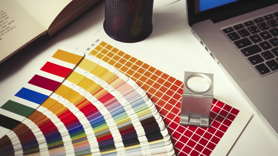
Utilize the color wheel to create an eye-catching color palette
The color wheel is an essential tool for any designer trying to create a visually appealing palette. It can help you figure out which colors complement each other and make your designs pop. When forming a color combination, try looking for combinations on the opposite sides of the wheel–opposite colors are often attractive together! If that doesn’t work, you might want to experiment with analogous colors – that are next to each other on the wheel. Going monochromatic or using triadic color schemes are great ways of making sure all your colors look perfect together. Most importantly, don’t be afraid to break out of the boundaries of the wheel by adding in extra shades or tints to provide a bit more variety and texture—the possibilities are endless!
Keep in mind the purpose of your design
No matter the type of design you are creating, always consider its purpose. The colors you select have the ability to influence a viewer’s reaction. Before settling on any color pallets, ask yourself if they will support or detract from your intended message. For example, bright and lively colors tend to be more conducive to designs with humorous or upbeat messages, while calmer and darker colors are often used in designs that convey seriousness. Thoughtful consideration of color can help ensure that your design achieves its desired impact.
Make a statement and stand out from other designs
Boring and dreary designs have their place, but if you’re looking to make a statement and really stand out then using bold or bright colors is the way to do it. Incorporating vivid colors into your design will give it an extra punch that attracts attention and invokes emotion. Plus, you don’t necessarily have to go with only one color – why not mix different shades together for a spectrum effect that showcases your design? With vibrant tones, you can make statements of varying intensity depending on the style you choose. Whether expressing joy or intensity, bold or bright colors will definitely take your design to the next level!
Achieve harmony within the piece
When creating a work of art, it’s important to understand the relationship between warm and cool tones. Warm colors tend to advance in a composition, while cool colors recede. Balancing these two types of color by strategically positioning them together within the piece helps create a sense of harmony and visual interest. If there’s too much variation in the range of warm and cool tones, however, the eye may be overwhelmed with too much stimulation. Finding that perfect balance is essential for having a successful piece that pleases both artists and observers!
Combine complementary colors to emphasis on important elements
Have you ever wanted to make an impression with laminated postcards in Atlanta? Color contrast and combinations of complementary colors can be utilized to highlight the most important elements. By contrasting, for example, a bright yellow against a deep blue background, a laminated postcard can draw attention and quickly communicate its message. Creating harmony between warm tones and cool tones is also important to ensure that your laminated postcard looks visually appealing. By paying attention to color contrast and combining complementary colors, laminated postcards in both Atlanta and beyond will achieve maximum impact when they reach their destination.
At the end of the day, color plays an important role when it comes to design. You want to make sure your strategy is in line with the mood or emotions you’re trying to evoke. Whether you choose something bold and daring, subtle and elegant, happy and cheerful, or calm and peaceful; experiment by combining different shades of colors together, paying attention to saturation levels and the purpose of your design. Utilize the color wheel to work harmoniously between warm and cool tones while taking into consideration visual context and the overall psychology behind each hue that you implement. Color is a powerful tool – use it wisely!